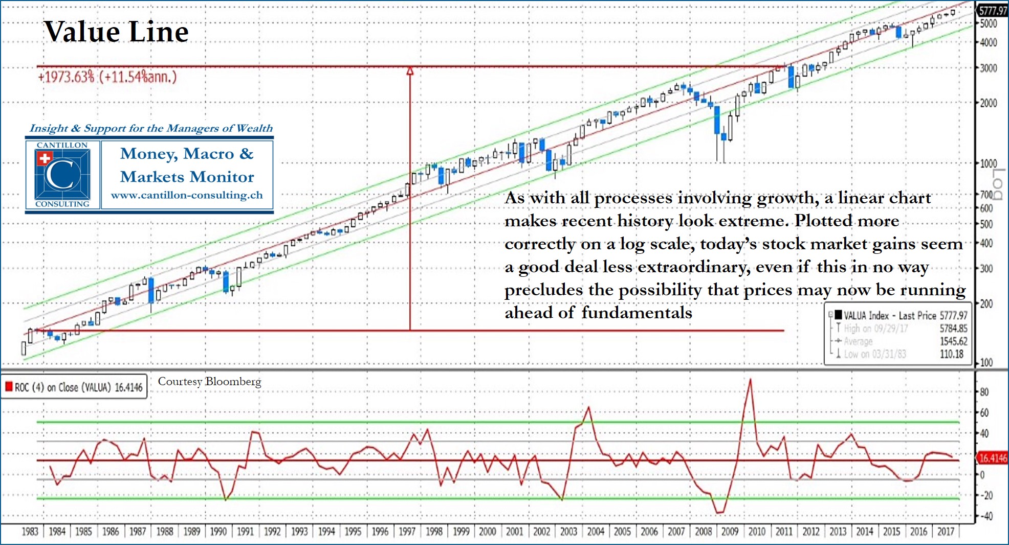
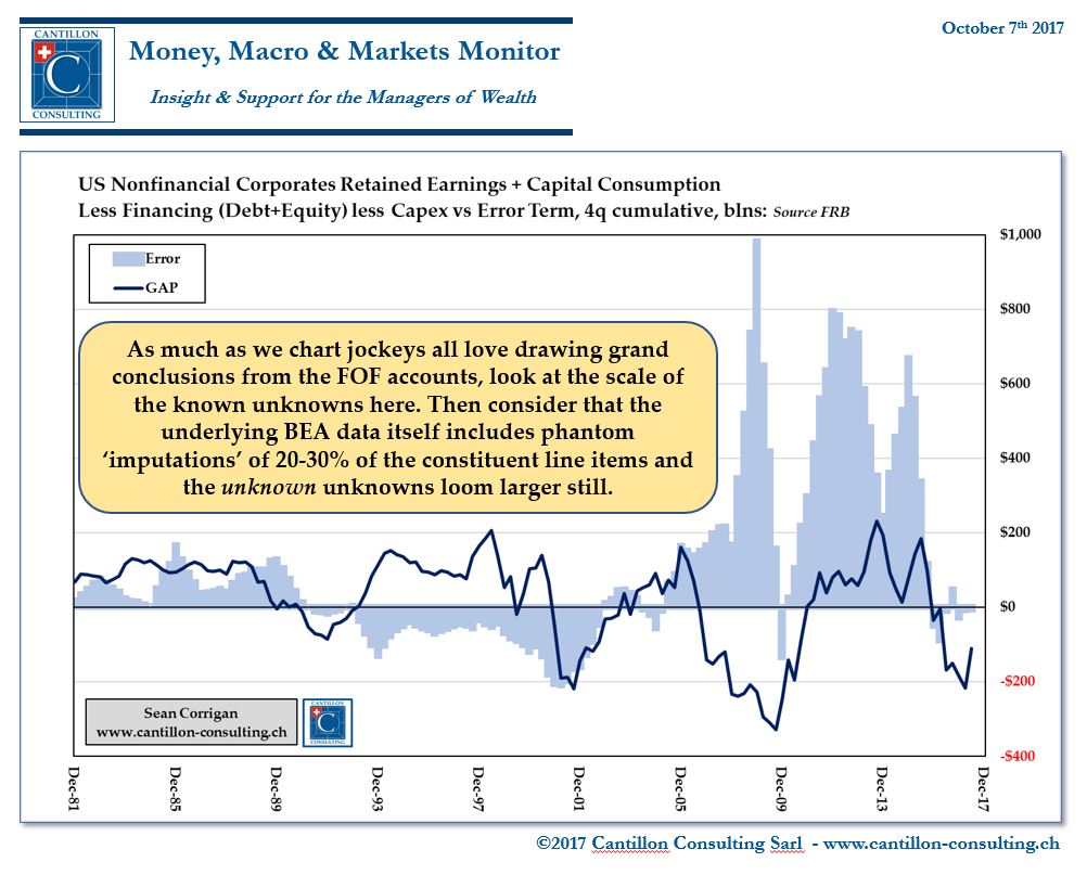
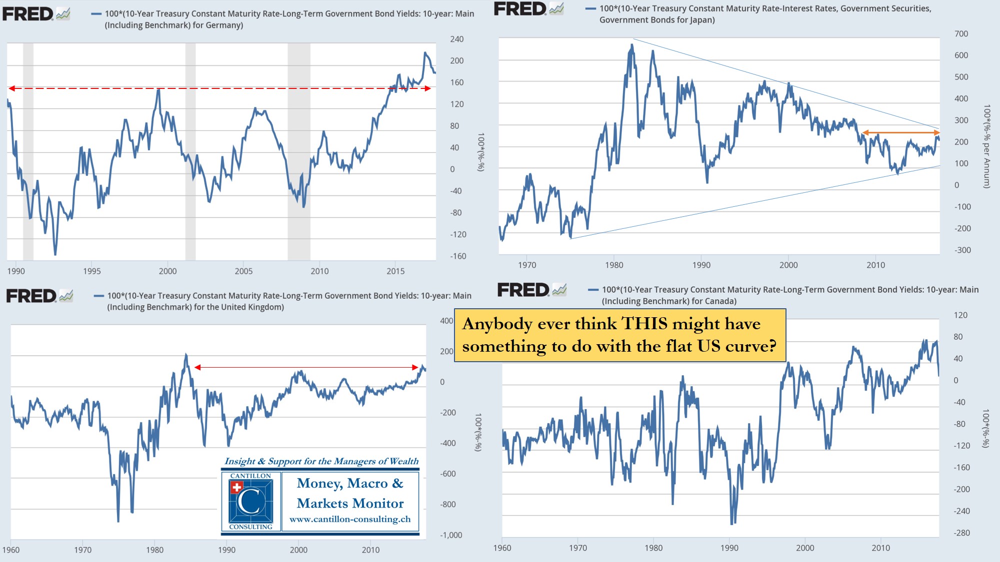
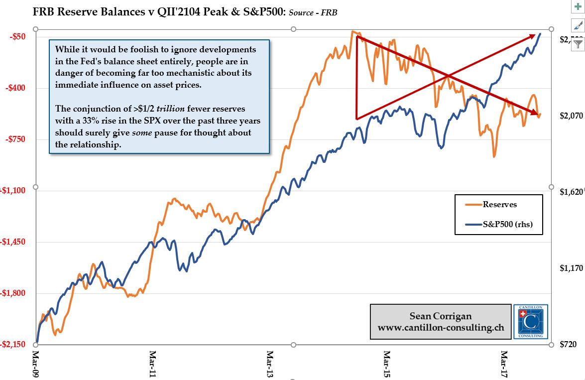
Does it make sense to plot multi-decade asset prices on a linear scale? How reliable are macro ‘profit’ estimates? Why is the curve flattening and what will a reduction in Central Bank reserve balances mean for assets?
S0me recent short snaps from my LinkedIn & Twitter feeds plus you can watch my latest update ‘China: Unbalanced’ here, on YouTube
Plot any exponential growth process over a linear scale for long enough and the top-right corner screams, ‘bubble’. No one denies the extraordinary valuations in equity markets or the risks they pose, but a more suitable log plot does lessen some of the angst.
[CLICK TO ENLARGE ALL GRAPHS]
Come the quarterly release of the Fed’s comprehensive ‘Flow of Funds’ accounts, we chart-jockeys all rush in to conjure up all sorts of noteworthy scenarios – usually aimed at showing the overblown nature of current conditions. However, caveat scribillator! All is not necessarily as it seems.
Curve flattening is a particular bug-bear of ours. Yes, there are very good reasons why bear flatteners herald recessions – Hayek’s ‘Investment that raises the demand for capital‘, q.v.
But is there a much simpler reason behind recent moves in the US?
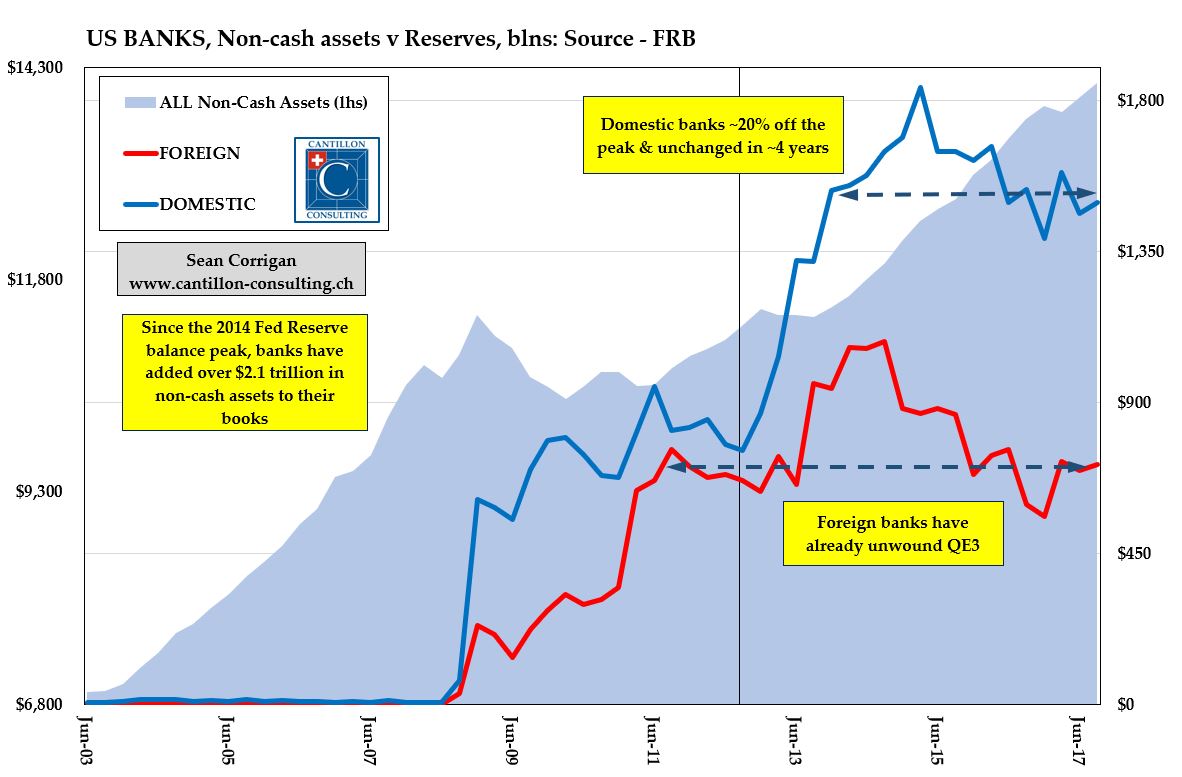
Another all-too common trope is the overlay plot of, for example, the Fed’s balance sheet with the post-Crisis trace of the S&P500 – a device usually followed with a cry of impending doom for the latter the instant the former starts to decline.
Again, no-one in their right mind denies that asset prices are where they are today in good part because of the past decade’s financial ‘heterodoxy’, but that still does not imply a one-for-one correspondence, as the following two graphs clearly demonstrate.
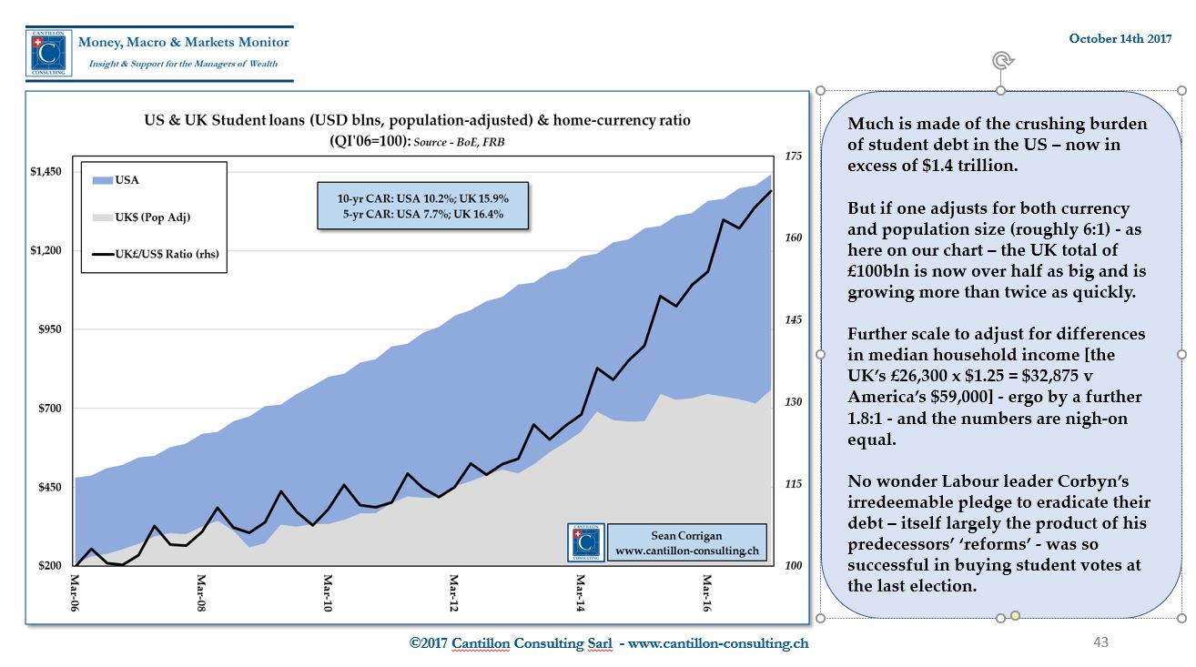
Finally, the mountain of debt being piled up in pursuit of a college education – and its ominous economic import – is never very far from the headlines these days. But what is not often appreciated is that – on some measures, at least – the position in the UK is every bit as bad and, moreover, is worsening even more rapidly.

