
While money can be made in markets on the minutest of scales, sometimes it helps to have a broader sense of perspective. After all, if you can’t locate yourself on a map – without the aid of GPS, children! – you don’t know where you are and if you have no grasp of history, you don’t really know who you are either.
Courtesy of Bloomberg
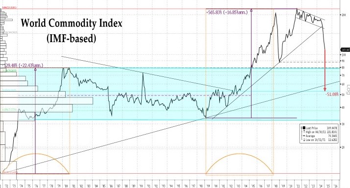
So, focusing on commodities in this instance, we here use the monthly IMF price report to construct an overall index composed of energy, ags, base and precious metals by blending them with the typical sort of weightings favoured by the major tradable indices of today.
As can be seen from the graph, commodities – priced in the dollar of the day over the last four decades of floating exchange rates and unanchored policy – form a neat, symmetrical pattern when plotted on a log scale (on which equal percentage, not arithmetical, moves have the same length). At the bottom left lies the substantial, two-stage rise in prices which finished by defining the upper and lower bounds of what would turn out to be a 33-year central value area, This took place, as needs little recounting, over the course of the two Oil Shocks of ’73-4 and ’79-80.
A long decline followed that first peak, one punctuated both with the 1986 oil crash – from which many are drawing a chastening lesson today – and with the spike which attended Saddam’s invasion of Kuwait and the First Gulf War, before the move came to an end in the chaos of the 1998 Russian bankruptcy and the climax of the shattering Asian Contagion.
From that nadir, we have lived through the so-called ‘Super-Cycle’, whose salient features were the run to near $150/bbl oil in 2008, the ensuing financial collapse, and the Great (Chinese-led) Reflation which followed. Three years were spent zigzagging lower in a narrow corridor thereafter – during which ags hit their highs, metals ground ever lower, and silver and gold each made record highs before going into their own, separate tailspins – then came the dramatic, front-led breakdown of the energy complex, the last resort of the commodity bull to that point, a man who luxuriated complacently in a narrowing range, falling volatility, and a then-remunerative inverted (‘backwardated’) forward curve.
From here, the question is whether the current uptick is any more than a bout of short-covering which is doomed to relapse and print new lows once the overstretch inherent in an almost uninterrupted 60% plunge is worked off, or whether some more meaningful recovery can be staged. We still have our doubts about the latter outlook and would watch for behaviour near the 2009 low and the old range high (or in terms of the most heavily weighted of the constituents, crude oil, whether it will hold above first $40/bbl then $35).
If not, we face the possibility of a reversion to the mean/mode of that 1974-2005 band at a level loosely corresponding to $20/bbl oil.
Courtesy of Bloomberg
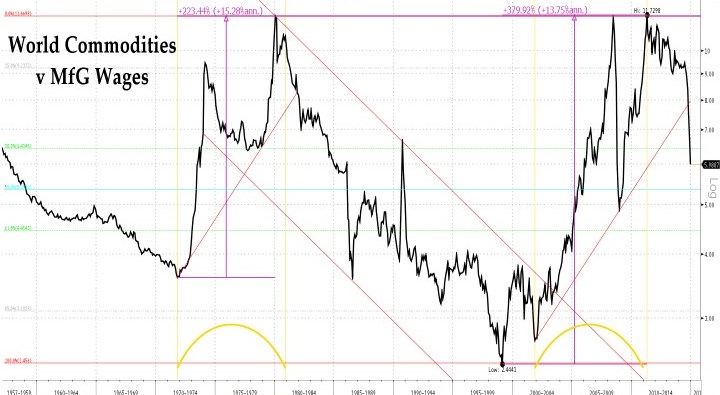
Of course, the foregoing discussion has all been conducted in nominal terms – that is, without allowing for the general decline in the purchasing power of the dollars in which the index is measured (itself something of a tail-chasing concept since we calculate that same depreciation by looking at how much ‘stuff’ a dollar buys today compared with yesterday and some of that same ‘stuff’ is energy itself, so this recalculation inevitably contains an inseparable mix of relative and absolute prices changes).
We choose here to make the adjustment not in terms of that often rejigged and housing-heavy basket of goods, the CPI index,, but in terms of what that aristocrat of the labour force, the American manufacturing worker, can buy with an hour’s worth of his time on the assembly line.
Once we make the necessary reckoning, the long decline over the last quarter of the last century is thrown into an even starker relief. It also becomes clear that the rise from the secondary, post-9/11 low to 2011’s reflation peak lasted almost exactly as long as did the first great lurch higher and that it reached its apogee at almost exactly the same height as did its forerunner.
Here, we would note that, while trading below the 199o spike and/or its nearby fib level, the distribution’s mid and the 2008 lows look well nigh unavoidable from a technical perspective.
Courtesy of Bloomberg
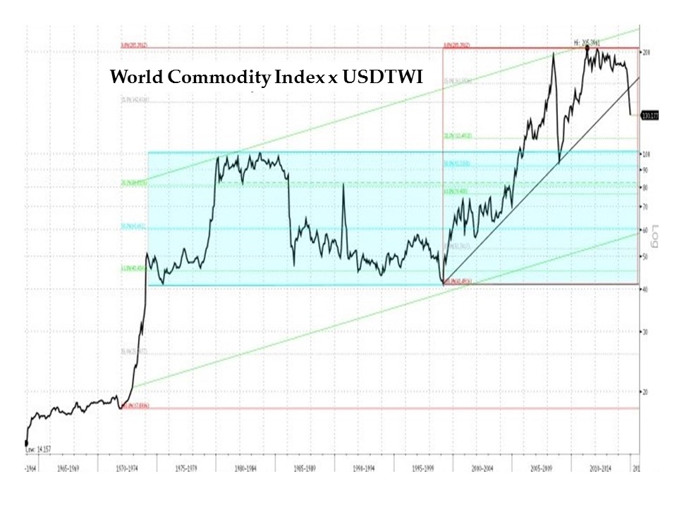
Having adjusted for the dollar one way, let us now do so in another. For the world beyond America’s boundaries, it matters not a jot if the dollar price of corn or cotton goes up by 10% if the greenback moves a similar proportion in the opposite direction in terms of the local unit of exchange. In order to isolate the history of price changes from the worst of this effect, the simplest – if very approximate – operation is to multiply the index by the trade-weighted value of the dollar and so we do.
Here, too, we can see how clearly delineated was the ‘Super-Cycle’ – i.e., that coincidence of China’s ‘opening up’ and the Europeriphery’s enjoyment of cheap German finance with a sustained spell of preternaturally low interest rates around most of the world (rates which now, of course, seem unattainably lofty!). the ‘Committee to Save the World’ has a lot to answer for!
We can also see just how decisive the last six month’s break has been and note that technicals, at least, offer little support for something still so historically elevated and presently so remote from any momentum-sapping area of well-populated precedent.
Courtesy of Bloomberg
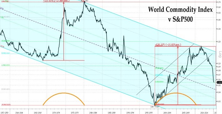
Finally, since only very few participants in our markets buy commodities for their own sake, but rather do so with a nod to the Modern Portfolio Theory superstition of ‘decorrelation’, we offer up a graph of commodity prices (not returns) versus stock prices (not returns). Now it is the various highs and lows which seem to define an all-encompassing, downward-sloping channel of chronic underperformance.
Within this long, gloomy run, we can identify two periods of relative commodity glory of roughly equal extent and duration, spaced some thirty years apart. The first occurred during the Great Inflation which bracketed the break-up of Bretton Woods and the first fumblings toward its replacement monetary order, the Age of the Independent Central Bank (reverentially capitalized, of course). The second, one might contend, coincided with the end of the so-called Great Moderation which followed and – we would suggest – with the ongoing transition to a new and yet unspecified era wherein the follies and failings of our generation of manically-active, inveterately hubristic, printing-press central planners will be utterly repudiated in its turn.
Ask not for whom the Bell Tolls; it Tolls for QE.
NB The foregoing is for educative and entertainment purposes only. Nothing herein should be construed as constituting investment advice. All rights reserved. ©True Sinews